Location: Jersey City
Architecture & Design: Mowery Marsh Architects
Photography: Haris Kenjar
When Jennifer and Brian Marsh first began working on residences in Hoboken in 2004, they did so by integrating interior design into their architecture. It wasn’t long before they became known as a top high-service residential firm and their projects began to shed light on what “could be” for Hudson County. They achieved this by working from a client’s personal style. In New Jersey, where design can at times seem a bit contrived, the husband and wife pair have aimed to create an aesthetic that is cleaner, simpler and lets the materials be the strength.
Mowery Marsh’s incredibly personalized approach and dedication to quality has undoubtedly set them apart. Most recently, the duo completed a modern makeover on an old Erie Street row house for a young couple in downtown Jersey City. The challenge was to create a bright, open space from a dim, tight-quarted 1850s structure.

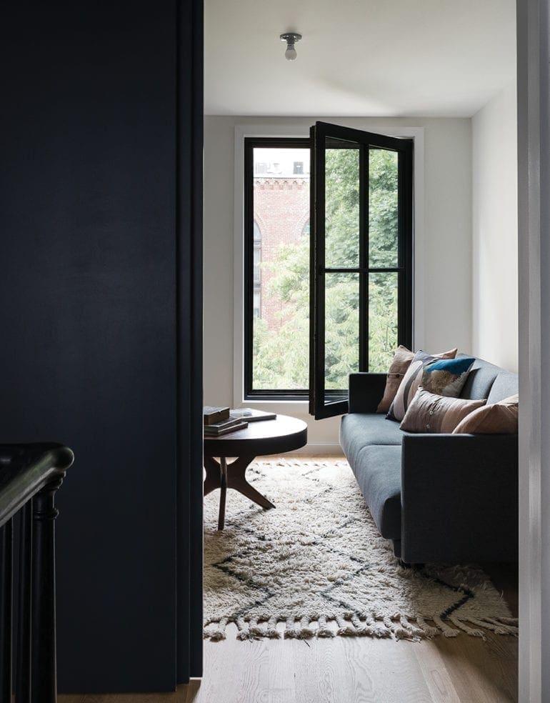
Another important goal for the project was to reconfigure the home with a more modern aesthetic. “When we came to the property, [the clients] lived on the first floor and ground floor with a rental space on the second floor and the attic. We basically flipped it,” Brian explained. The new plan gave the family the kitchen, dining and living rooms on the first floor, with a straight staircase connecting to the second floor with the master bedroom, the guest room and the homeowners’ son’s room.
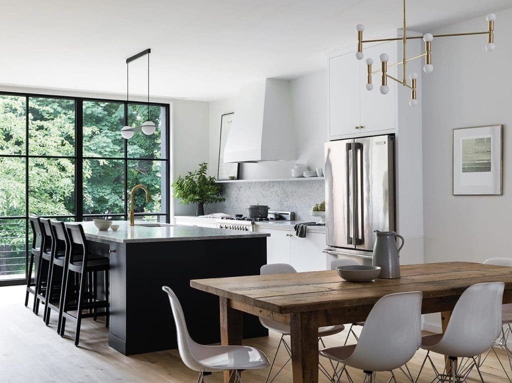
Inside this modern rowhouse, the architects brought in natural light to first floor via triple-glazed windows (which also required them to rebuild the back wall of the home). Here, the well-lit space paired with Carrara marble countertops and backsplash results in that clean aesthetic the clients had hoped for. The room is also an example of the completed project’s blend of new world and old, with modern lighting fixtures from Lambert & Fils and décor from before the renovation like the wood dining table.
The kitchen overhaul came as a particularly challenging situation given the fact that like everything else, it too, had to be reconfigured. “The existing kitchen was up a step or two because when the original addition was put on, they didn’t line up any level. There was a lot of trying to forget what was there and reimagine how it could work. We try to show our clients what’s possible and to not be limited by what they see,” Jennifer said.

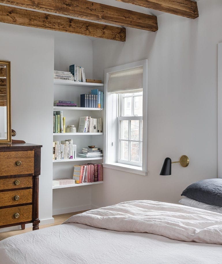
The architects had initially hoped to save more of the home’s original framing, but in many instances it was simply easier to start over. In the case of the home’s original master suite, the layout had a few imperfections to iron out due to the fact that the original structure had two overlapping roofs. Some old characteristics such as original wood beams made the final cut inside the master to preserve that old charm—but even those had to be readjusted as they weren’t previously straight.
The attic above the modern rowhouse was reinvented to be a sort of mezzanine master office. The purpose of this was twofold: create an extra space for the family and make the room feel more spacious and airy. “We opened the ceiling up to the loft area. It’s a bonus room up there for the client. They can go up the ladder to an office, exercise area or whatever they might use it for as part of their master. I would say a bigger component of that was just to give the room more volume and make it feel more special,” Jennifer added. The team added a fresh coat of Benjamin Moore Decorator’s White throughout the home, which was another key in making these rooms feel larger.

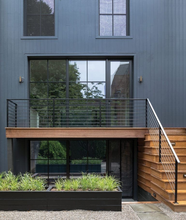
Outside, the architects aimed to make it look like it was an addition to the historic house. The home’s front facade, a charming old brick row house, is much like its neighboring homes which all have additions on the back. In the rear though, the design team took the opportunity to once again seamlessly blend modern and traditional with a mahogany wood deck and steel railings.
“Traditionally, an addition would have come later and would’ve been a wood clad structure,” Brian said. “We didn’t want it to just be brick or stucco, we wanted it to have that charm of a wood clad shed addition that gets attached to these traditional homes. There’s the twist with all the glass and the clean modern railing that almost seems to disappear. We’re trying to make the house feel more connected and larger to the outside.”
Michael is the Editor-in-Chief of New Jersey Digest and Creative Director at X Factor Media. A Bergen County native, he discovered his passion for storytelling while studying at Montclair State University. In addition to his work in journalism and media, Michael is an avid fiction writer. Outside the office, he enjoys kayaking, a bold glass of Nebbiolo, and the fine art of over-editing.
- Michael Scivoli
- Michael Scivoli
- Michael Scivoli
- Michael Scivoli
- Michael Scivoli
- Michael Scivoli
- Michael Scivoli
- Michael Scivoli
- Michael Scivoli
- Michael Scivoli
- Michael Scivoli
- Michael Scivoli
- Michael Scivoli
- Michael Scivoli
- Michael Scivoli
- Michael Scivoli
- Michael Scivoli
- Michael Scivoli
- Michael Scivoli
- Michael Scivoli
- Michael Scivoli
- Michael Scivoli
- Michael Scivoli
- Michael Scivoli
- Michael Scivoli
- Michael Scivoli
- Michael Scivoli
- Michael Scivoli
- Michael Scivoli
- Michael Scivoli
- Michael Scivoli
- Michael Scivoli
- Michael Scivoli
- Michael Scivoli
- Michael Scivoli
- Michael Scivoli
- Michael Scivoli
- Michael Scivoli
- Michael Scivoli
- Michael Scivoli
- Michael Scivoli
- Michael Scivoli
- Michael Scivoli
- Michael Scivoli
- Michael Scivoli
- Michael Scivoli
- Michael Scivoli
- Michael Scivoli
- Michael Scivoli
- Michael Scivoli
- Michael Scivoli
- Michael Scivoli
- Michael Scivoli
- Michael Scivoli
- Michael Scivoli
- Michael Scivoli
- Michael Scivoli
- Michael Scivoli
- Michael Scivoli
- Michael Scivoli
- Michael Scivoli
- Michael Scivoli
- Michael Scivoli
- Michael Scivoli
- Michael Scivoli
- Michael Scivoli
- Michael Scivoli
- Michael Scivoli
- Michael Scivoli
- Michael Scivoli
- Michael Scivoli
- Michael Scivoli
- Michael Scivoli
- Michael Scivoli
- Michael Scivoli
- Michael Scivoli
- Michael Scivoli
- Michael Scivoli
- Michael Scivoli
- Michael Scivoli
- Michael Scivoli
- Michael Scivoli
- Michael Scivoli
- Michael Scivoli
- Michael Scivoli
- Michael Scivoli
- Michael Scivoli
- Michael Scivoli
- Michael Scivoli
- Michael Scivoli
- Michael Scivoli
- Michael Scivoli
- Michael Scivoli
- Michael Scivoli
- Michael Scivoli
- Michael Scivoli
- Michael Scivoli
- Michael Scivoli
- Michael Scivoli
- Michael Scivoli
- Michael Scivoli
- Michael Scivoli
- Michael Scivoli
- Michael Scivoli
- Michael Scivoli
- Michael Scivoli
- Michael Scivoli
- Michael Scivoli
- Michael Scivoli
- Michael Scivoli
- Michael Scivoli
- Michael Scivoli
- Michael Scivoli
- Michael Scivoli
- Michael Scivoli
- Michael Scivoli
- Michael Scivoli
- Michael Scivoli
- Michael Scivoli
- Michael Scivoli
- Michael Scivoli
- Michael Scivoli
- Michael Scivoli
- Michael Scivoli
- Michael Scivoli
- Michael Scivoli
- Michael Scivoli
- Michael Scivoli
- Michael Scivoli
- Michael Scivoli
- Michael Scivoli
- Michael Scivoli
- Michael Scivoli
- Michael Scivoli
- Michael Scivoli
- Michael Scivoli
- Michael Scivoli
- Michael Scivoli
- Michael Scivoli
- Michael Scivoli
- Michael Scivoli
- Michael Scivoli
- Michael Scivoli


