
When thinking about your home—whether it’s the décor, paint or furnishings—we’re all inherently drawn to certain hues. Red, for example, is believed to reflect someone’s tenacity while yellow is often synonymous with positive energy. Surely artists and interior designers alike understand this psychology better than anyone since their palettes ultimately have the ability to influence one’s mood or behavior.
Going beyond just aesthetics, the experts at Pantone chose Classic Blue as 2020’s Color of the Year for a specific emotional and psychological reason. “Imprinted in our psyches as a restful color, PANTONE 19-4052 Classic Blue brings a sense of peace and tranquility to the human spirit, offering refuge. Aiding concentration and bringing laser-like clarity, Classic Blue re-centers our thoughts. A reflective blue tone, Classic Blue fosters resilience.”
Across the home and design industry, Pantone says that Classic Blue is a pervasive favorite because it offers a stable foundation that can be built upon. Assuming we all want to live in an emotionally healthy household, we’re laying out how to use Classic Blue, and what it can do for your space.
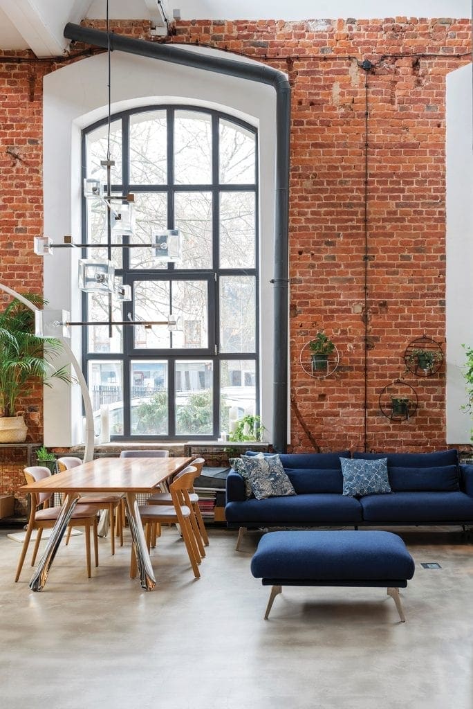
Evokes a Sense of Calm
The 2020 Color of the Year has been jokingly referred to by social media as “Anti-anxiety Blue,” but science says that the color can actually help to lower blood pressure, clear the mind and steady one’s breathing. In terms of functionality and incorporating it into your home, think anywhere you would want to sleep, dream or relax—most likely a bedroom or living area.
Makes a Space Feel Bigger
When paired with a neutral, this shade of blue can make spaces feel larger. On the walls of a smaller room, it references the sky or sea—both wide-open, expansive spaces. In a more sizable setting, colorful Classic Blue accents can help draw the eye in.
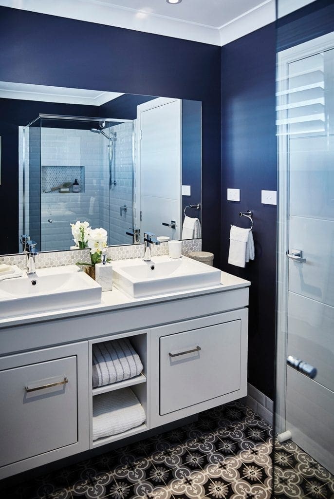
Increase Home’s Selling Price
According to a 2017 study done by Zillow, houses that had blue-colored bathrooms sold for approximately $5,440 more than other comparable listings. While the reasoning behind the findings varies, blue has long been a popular complement to countertops and cabinets which is why buyers can usually find it in kitchens and bathrooms.
Transcends Styles and Trends
Blue is one of the most dynamic tones that we have to work with. It can be both masculine or feminine, natural and dramatic. In this era, Pantone’s Classic Blue harkens back to traditional design styles but enters new territory with modern finishes and textures such as suede, velvet and taffeta.
About the Author/s
Abby is The Digest's Managing Editor. She spends her time looking at dogs on Instagram and eating her way around Jersey City.