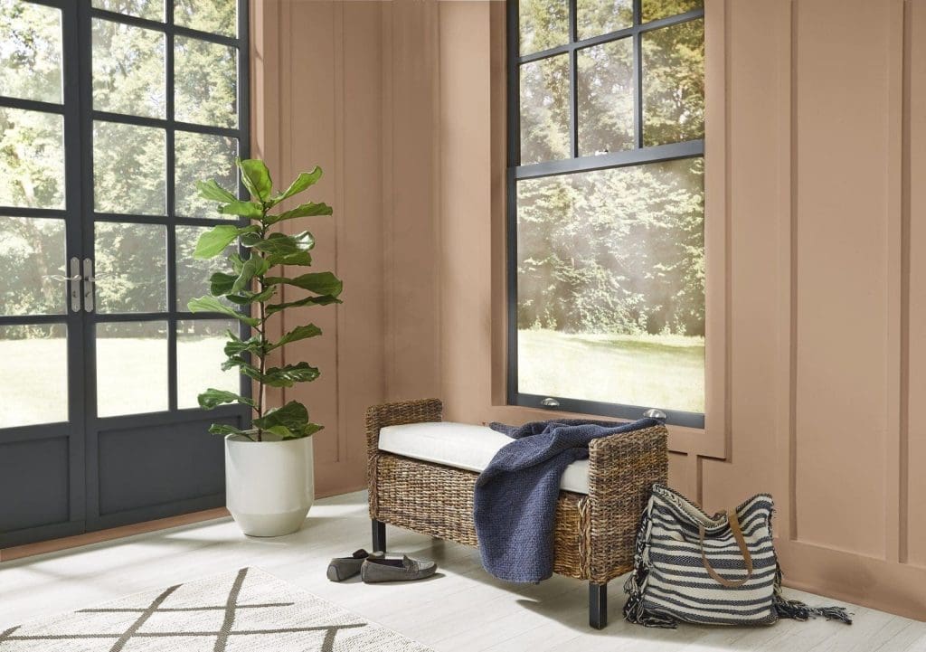
Is it too soon to start thinking about 2021? Behr Paint Company certainly hasn’t wasted any time. So, they released their 2021 palette early last week, with “21 colors to elevate your comfort zone.” Behr is no doubt referencing the fact that our homes have become a place refuge–in addition to our workspace and in some cases, a classroom. When it comes to deciding the trending paint colors for 2021, Behr took into consideration the latest in lifestyle and design trends.
“This has been a year of unpredictability and 2020 has significantly changed our relationship with our home,” said Erika Woelfel, Vice President of Color at Behr. “When our color team began exploring a palette for the coming year, we knew it needed to be grounded in what we’ve been craving: comfort and personalization. A new, ‘elevated’ articulation of ‘comfort’ goes beyond traditional beige, gray and green hues, and embraces color in a way that can redefine and enhance any type of space inside or outside the home.”
There are five interior themes to note. They include Casual Comfort, Subtle Focus, Optimistic View, Quiet Haven and Calm Zone. The sixth and final motif, Outdoor Escape, is designed to up your home’s exterior curb appeal. To make your painting venture even easier, this palette was designed to be versatile. All the colors throughout each theme were meant to complement one another, so you can mix and match without worrying. If you’re wondering what the trending paint colors for 2021 are, let these palettes serve as your #inspo.
Casual Comfort
Is your style farmhouse chic? Casual Comfort is full of muted, warm-toned neutrals that are ideal for minimalists and boho-lovers alike. The hues include soft and serene colors such as Almond Wisp PPU5-12. Behr notes that “light warm neutrals and whites create an inviting feeling in entryways, kitchens and open living spaces.”

Optimistic View
The bright, luxe shades in Optimistic View give us a bit of wanderlust without having to leave the house. Sea-toned blues remind us of Mediterranean waters and hues like Kalahari Sunset MQ1-25 and Saffron Strands PPU6-02 are bold, playful choices that tie in a global decor motif. According to Behr, “a pop of bright color lifts the mood in any space, making it great for kitchens, playrooms and anywhere you want to feel energized.”

Subtle Focus
With the whole family running around (pets included), it’s no surprise that people have experienced trouble focusing while working from home. For increased attention, Behr recommends light hues that feel sophisticated, inviting and most importantly, serene. Therefore, they’ve introduced tinted pastels like Seaside Villa S190-1 and Wishful Green M410-2.

Quiet Haven
Full of rich and evocative colors, the “deep hues have a reassuringly sublime and dependable nature, delivering the effect of a peaceful oasis in your home.” Ideal for those who prefer a more modern-looking residence, Behr delivers on maximalist hues including Nocturne Blue HDC-CL-28 and Barnwood Gray PPU24-07. The darkest in the collection, Broadway PPU18-20, makes a great option for a moody accent wall or trim.

Calm Zone
Calm Zone is all about bringing nature in. Nurturing blues and greens are an ode to the increase in wellness and self-care. There’s the verdant Jojoba N390-3 and Jean Jacket Blue S510-4, both of which will remind you of an afternoon at the park, morning hikes or perhaps weekend trips to the lake. “Soothing blues and greens create a restorative escape offering ease and solace,” says Behr.

Main image courtesy of Behr / Sierra N240-4 from Casual Comfort theme
Abby is The Digest's Managing Editor. She spends her time looking at dogs on Instagram and eating her way around Jersey City.
- Abby Montanezhttps://thedigestonline.com/author/abby/
- Abby Montanezhttps://thedigestonline.com/author/abby/
- Abby Montanezhttps://thedigestonline.com/author/abby/
- Abby Montanezhttps://thedigestonline.com/author/abby/


